Showing posts with label DDB. Show all posts

Oct 16, 2012

I Can Haz Vintage Catvertising

Cats in print.

They've been doing it for years in advertising - "catvertising" or "meowketing".

Long before keyboard kitties and LOLcats dominated the digital sphere. Cats (as well as dogs and other little furries) resonate with the domestic audience and pet lovers around the world.

Here's a look back at a select few vintage print ads featuring our feline friends.


Black Cats

Poster for "Cabaret du Chat Noir" Re-opening, Paris, 1896.
The translation of "Chat Noir" from French is "Black Cat" (no surprises there). The above poster advertises the re-opening of the "Cabaret du Chat Noir" in Paris, October, 1896.


Le Chat Noir, 1922.
This is a cover for a French 25 cent weekly journal. which I assume has something to do with knitting. The scrawl of writing below the title reads what looks to be "J'evide les nerf en pelote?" which roughly translates to "My nerves are like a ball of yarn (being toyed with by a cat)".


Lanvin Perfume, "My Sin", 1950's.
This advertising poster was part of a campaign for Lanvin perfume in the 1950's. Here we see the black cat as a symbol of elegance, style and perhaps mystery.


Boucheron, "Black Cat", 1986.
 The black cat in Boucheron's 1980's campaign offers a sense of luxury and desire.


Movado Museum L'Imperiale, Black Cat Example, 1980.
More than a few jewellery brand names used a black cat to help position their brand. Here, Movado uses the picture of a real black cat with silhouetted green eyes.


White Cats

White cats with their bright, fluffy and pristine fur are another frequent feline feature of ads over the years.

Fleetwood Cigarettes, 1943.
They are often portrayed as symbols of purity and innocence and cleanliness - and as can be seen above, even for a brand of smoky cigarettes.


National Society Of Radiators, "Ideal Classic", Italy (Undated)


Gaines Viso, Viso Gürtel, Poster by Von Allmen, 1950.
  Cats (of any color) can also depict royalty, high stature or simply vanity.


Kittens

The power of cuteness in print.

Packer's Tar Soap, 1906.


The Orgasmatron from The Pink Pussy Cat Boutique, "Xmas", 1975.
I believe the little kitten above on the "Orgasmatron" is purely metaphorical.


Other Kitties
Chevrolet Corvette, "Love Seat", The New Yorker, 19th May, 1956.
I wonder if Chevy picked this cat for the photo purely because its coat matched the leather seats??


Tabby Cats

By the 1980's, tabbies featured quite prominently in ads as the cat for the everyman. Many of these ads weren't particularly special unless you had a tabby of your own you could relate to. They are usually used for cat-related brands and products to display a range of kitty emotions.


Purina, "Happy Cat" Cat Food, 1984.
Happy tabby is happy.


"Kitty Litter Brand" Kitty Litter, 1984.
Sad tabby is sad.


Meow Mix, 1987.
Hungry tabby is hungry.


And Finally...

One of the ads from the original "Mad Men" era that helped to spawn the creative advertising revolution of the 1960's. This ad, featuring a decked out cat, was developed by Bill Bernbach, ad creative guru, from Doyle Dane Bernbach along with Bob Gage (Art Direction) and Judy Protas (Body Copy). Together, they came up with an interesting idea to promote Ohrbach's Department Store to fashion-conscious New Yorkers.


Ohrbach's Department Store, "I found out about Joan", Doyle Dane Bernbach, NYC, 1958.
Headline & Body Copy:

I found out about Joan

The way she talks, you'd think she was in Who's Who. Well! I found out What's what with her. Her husband owns a bank? Sweetie, not even a bank account. Why that palace of theirs has wall-to-wall mortgages! And that car? Darling, that's horsepower, not earning power. They won it in fifty-cent raffle! Can you imagine? And those clothes! Of course she does dress divinely, But really... a mink stole, and Paris suits, and all those dresses... on his income? Well darling, I found out about that too. I just happened to be going her way and I saw Joan come out of Ohrbach's!


May 31, 2011

Does Wonderbra lift and separate from the other handful of bra brands?

Over the last few years, there's been a particular branding campaign which has captured my gaze.

Even though the campaign isn't directed at me, I still notice these ads and can't look away.

"DD", Saatchi & Saatchi, 2006, 

Wonderbra is a lingerie company that's been around for most of the last century but really only uplifted its name globally in the 1990's. They differentiated themselves as the bra brand which not only enhances a woman's bust line but makes heads turn.

"Hello Boys", TBWA, 1994.


A controversial print / poster / billboard outdoor ad campaign by TBWA in 1994, with Eva Herzigova, kicked off this new creative strategy which spanned the globe and covered numerous different ad agencies.

But over the last decade, the branding campaign switched focus to a strategy where the ads displayed don't show the cleavage being enhanced but the results and consequences.

Focussing on the outcome rather than the eye-grabbing spectacle of the bras themselves, the campaign lets the viewer make the connection.

Some of these are rather obvious while others are more subtle and make you think.


"Shoes", Saatchi & Saatchi Singapore, 2002.
This ad caught my eye in a creative advertising magazine. It may not be apparent at first, but I think it works on two levels. The woman in the ad can't see her feet because she's wearing a Wonderbra. So she's unaware of the mismatched shoes. I also thought that no one else on the street notices her shoes as they are all looking at the woman's cleavage (not shown).


"Umbrella", Publicis, Paris, France, 2007.
It takes a while for some people to get this one.

It's not the vacant outdoor courtyard. Or the number of shopping bags.

(What's holding the umbrella?)


"Friends", Publicis, France, 2009.
A more obvious one but still direct and simple.


"Baby", possible spec work / mock ad.
This one is both funny and creepy at the same time. I can't seem to find an agency source for this ad which makes me think it may be a spec or mock / parody.


"Scooter", TBWA Praha, Czech Republic.
Not so subtle but still lets the viewer make the leap by the way the image has been cropped below the chest line.


"Economist", DDB Worldwide, Singapore.
This ad parodies the well-known,  long-running outdoor campaign for The Economist which is "written by intellectuals for intellectuals."

Some people have criticized this ad regarding its intention. Is the Wonderbra wearer quoted ("Linda Foster, CEO, aged 29") too smart for The Economist? Or is she not smart enough? Is it because she shows cleavage that she doesn't have to be smart to get where she wants? Is every man at her beck-and-call?

Or is it more simply that the bra works so well that the wearer can't see below it to read a magazine like "The Economist"?

I think the final suggestion is the idea DDB were trying to get across with this ad but some read it differently.


"Oranges", Copy: "Fits Naturally",  possible spec work / mock ad.
I couldn't find an agency reference for this ad so it may be another spec or mock ad. The oranges being a metaphor for the perfect "natural fit".


"Pants", possible spec work / mock ad.
Another possible spec / parody. The sheer number of these add to the brand as they are spread virally, but may be beyond the control of the Wonderbra company.


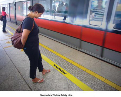
"Yellow Safety Line", Guerrilla Advertising, Euro RSCG, Singapore, 2008.
Interesting guerrilla placement by Euro RSCG Singapore - adding a second yellow safety line futher behind the regular line at public train stations in Singapore.


There has been criticism by some advertisers of Wonderbra's campaign in that it may not speak directly to its target audience of women. Some say that these ads have been designed by advertisers (predominantly men) for other advertisers (other men).

I don't agree with that entirely and I guess it differs from ad to ad. They do have a consistent visual element without the use of copy to convey their idea. It unhooks the viewer's mind to make the connection - that last step of "the big idea".

I've been meaning to cover this campaign in my blog for a while, so I'm glad to be finally getting this post off my chest (sorry for the pun/s... lol).