Showing posts with label Publicis. Show all posts

Apr 13, 2012

A Titanic Addiversary

With the 100 year anniversary of the world's most famous sinking tragedy fast approaching, I thought I'd dig up a few ads from eras bygone and recent related to the Titanic.


White Star Line, Titanic Poster, 1912
This is one of several original posters from 1912 leading up to the fateful date, promoting the first (and final) voyage of "the largest liner in the world".


R.M.S. Titanic, "Vinolia Otto Toilet Soap", 1912.
And the merchandising. Published only once, a black & white version of this ad (with a slightly different layout) appeared in the April 6, 1912 edition of the London Illustrated News. The Toilet Soap was provided to First Class passengers and also available for purchase by the London public.


Titanic Return Voyage, 1912.
White Star Line also advertised in New York for the return trip from Pier 59 back to Europe. Obviously it never eventuated.


It seems advertisers steered clear of referencing the Titanic in any way until the popularity of the award-winning blockbuster movie in 1997 revived its popularity (I haven't been able to find any Titanic-themed ads before 2000).

Here are several print ads I found that pick up on the Titanic theme in different ways.

TAM Airlines Onboard Entertainment, "Titanic"
Ad Agency: Y&R Brazil, 2008.
Capitalizing on the success of the Titanic blockbuster movie, Y&R Brazil offers a different perspective of the event for TAM Airlines Onboard Entertainment.


Orange, "Iceberg"
Ad Agency: Ignitionk, Madrid, Spain, April, 2009.
Ignitionk went for a text & space approach to help illustrate Orange's audiodescription system for the blind.


Washin Opticians, "Titanic"
Ad Agency: Grey Tokyo, 2011.
One of two Titanic themed ads that sells the benefits of optical eyewear, Grey Tokyo illustrate the outcome had the ocean liner's captain and crew been wearing glasses by Washin Opticians.


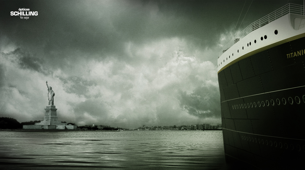
Optics Schilling, "Titanic"
Ad Agency: Unitas-RNL, Santiago, Chile, 2009.
In this second eyewear ad (which actually came first chronologically), Unitas-RNL shows the end result thanks to Optics Schilling glasses.


Another "theme" I noticed in recent Titanic-based ads was that several focussed on the ship's size.

Megastar Cineplex, "Titanic"
Ad Agency: Ogily & Mather, Vietnam 2007.


Vodafone Mobile Video Store, "Titanic"
Ad Agency: Scholz & Friends NRW, Dusseldorf, Germany, January, 2010.

Both of these ads "bend" the visual by presenting the Titanic as being small or miniature. In both examples, the iceberg is reduced to an ice cube. And both ads are selling the idea of watching the big blockbuster movie on a small screen (the first as a negative and the second as a positive).


Another reoccuring theme I found in recent advertising which references the Titanic refers to the famous "I'm Flying" romantic sequence from the movie.

Utopolis Group Of Cinemas, "Titanic"
Ad Agency: Duval Guillaume, Antwerp Belgium 2007.


Toys R Us, "Titanic"
Ad Agency: Volcano Advertising, Johannesburg SA, 2007.


Sanyo XactiCA8, "Titanic"
Ad Agency: Whybin TBWA Tequila, Sydney, Australia, 2008.


Suraj Electronics, "Pixels"
Ad Agency: JWT, New Dehli, India, 2010.
Credit should probably go to the first two of these as they came out in the same year. And at least the Australian one takes it underwater. In my opinion, the last one from India is the weakest of these.


I did find several other recent ads that reference the Titanic but the rationale or strategy tie-in with the product or benefit was either weak, sunk altogether or perhaps lost in translation.


Dec 20, 2011

Kim-vertising

Hot on the heels of other fallen dictators and terrorist leaders who have recently died, we have the passing of North Korea's "Dear Leader" seeing out the year (although there is still about a week and half left this year for Ahmadinejad, Mugabe or Castro if they want to join the list).

Following my previous blog posts on Bin Laden's Legacy in Advertising and Gaddafi in Advertising, it's only fair to look at "faminist" Kim Jong-il's image as used in advertising (primarily print and posters here).


International Society for Human Rights (ISHR)
Ad Agency: Scholz & Friends, Berlin, Germany, 2009.

Celebrating 60 years of the ISHR promoting human rights, the anniversary cakes were "shared" with various leaders of dictatorships around the world, including Kim.


ISHR
Ad Agency: Ogilvy, Frankfurt, Germany. 2010

The ISHR more recently also had a campaign showing world dictators scared of the modern mouse. This particular ad is poorly photoshopped but still conveys the intended message.


S-K Bedding & Mattresses
"Who says there's no rest for the wicked?"
Ad Agency: Publicis, South Africa, 2004.
SK Bedding and Publicis used North Korea Freedom Day, April 28, 2004, to help promote their product.


Nulaid Eggs
"History's produced a lot of bad eggs.
Thankfully, ours are always good."
Ad Agency: The Jupiter Drawing Room, South Africa, 2007.

Also from South Africa, Nulaid Eggs uses Jong-il's likeness in egg form to illustrate a bad egg.


Amnesty International
Ad Agency: Contrapunto BBDO, Madrid, Spain, 2008.


Amnesty International
"See no evil?"
Ad Agency: LINs, Malaysia, 2008.


Amnesty International
"Your signature has the power"
Ad Agency: TBWA, Paris, France, 2008.

2008 saw a volley of ad rockets fired by Amnesty International against North Korea's supreme leader as well as others.

Contrapunto BBDO used the fly on the nose (using Amnesty's logo) as a symbol and visual metaphor for human rights abuses which is as plain as the nose on their face, right in front of these leaders' eyes and yet never quite visible to them.

The campaign from LINs in Malaysia is not quite as clear. It uses the recent optical illusion meme of staring at a point (in this case a red crosshair mark) for several minutes and then looking at a white surface to reveal a face illusion. These directions aren't given in the ad and therefore assumed that people know what to do when viewing it. Also there is a tenuous link between this and the ad's message ("See no evil?") which may have been somewhat lost in translation (?).

The final ad here, by TBWA Paris, is the most clear and powerful (and also featured in my Gaddafi blog post).


Reporters Without Borders
"Only a free press can hurt them.
Support our fight."
Ad Agency: Saatchi & Saatchi, Paris, France, 2010

Reporters Without Borders and Saatchi & Saatchi Paris put together a campaign last year which reverts to the visual metaphor of a crushed press image of global dictators.


Benetton, "UNHATE" campaign
Ad Agency: Fabrica, Italy, 2011.
Benetton's recent "UNHATE" campaign, was able to manufacture a final kiss (kiss of death?) between Kim and South Korean president, Lee Myung-bak. This was an interesting campaign featuring several adversarial world leaders in intimate positions.


Amnesty International Portugal, "Tyrannybook" app
Ad Agency: Leo Burnett, Iberia, 2010.

Kim Jong-il profile, Tyrannybook.
Tyrannybook, a digital app designed and implemented by Leo Burnett Iberia in for Amnesty International Portugal in 2010, This was a social network (which has since been discontinued) dedicated to the surveillance of some of the most tyrannical world leaders that violate human rights.

Modelled on the look and aesthetics of Facebook, both users and the organization can update leaders' profiles on their most recent abuses. Users could also link up as allies and participate in group discussions, exchange points of view and discuss current events.

While this app has now expired, it may have been a foretelling of the role Facebook would play in the 2011 Arab Spring uprising through the Middle East.


With Kim Jong-il kicking the bucket, advertisers now have one less dictator to use in their messages. 2011 has been a terrible year for oppressive global leaders.

May 31, 2011

Does Wonderbra lift and separate from the other handful of bra brands?

Over the last few years, there's been a particular branding campaign which has captured my gaze.

Even though the campaign isn't directed at me, I still notice these ads and can't look away.

"DD", Saatchi & Saatchi, 2006, 

Wonderbra is a lingerie company that's been around for most of the last century but really only uplifted its name globally in the 1990's. They differentiated themselves as the bra brand which not only enhances a woman's bust line but makes heads turn.

"Hello Boys", TBWA, 1994.


A controversial print / poster / billboard outdoor ad campaign by TBWA in 1994, with Eva Herzigova, kicked off this new creative strategy which spanned the globe and covered numerous different ad agencies.

But over the last decade, the branding campaign switched focus to a strategy where the ads displayed don't show the cleavage being enhanced but the results and consequences.

Focussing on the outcome rather than the eye-grabbing spectacle of the bras themselves, the campaign lets the viewer make the connection.

Some of these are rather obvious while others are more subtle and make you think.


"Shoes", Saatchi & Saatchi Singapore, 2002.
This ad caught my eye in a creative advertising magazine. It may not be apparent at first, but I think it works on two levels. The woman in the ad can't see her feet because she's wearing a Wonderbra. So she's unaware of the mismatched shoes. I also thought that no one else on the street notices her shoes as they are all looking at the woman's cleavage (not shown).


"Umbrella", Publicis, Paris, France, 2007.
It takes a while for some people to get this one.

It's not the vacant outdoor courtyard. Or the number of shopping bags.

(What's holding the umbrella?)


"Friends", Publicis, France, 2009.
A more obvious one but still direct and simple.


"Baby", possible spec work / mock ad.
This one is both funny and creepy at the same time. I can't seem to find an agency source for this ad which makes me think it may be a spec or mock / parody.


"Scooter", TBWA Praha, Czech Republic.
Not so subtle but still lets the viewer make the leap by the way the image has been cropped below the chest line.


"Economist", DDB Worldwide, Singapore.
This ad parodies the well-known,  long-running outdoor campaign for The Economist which is "written by intellectuals for intellectuals."

Some people have criticized this ad regarding its intention. Is the Wonderbra wearer quoted ("Linda Foster, CEO, aged 29") too smart for The Economist? Or is she not smart enough? Is it because she shows cleavage that she doesn't have to be smart to get where she wants? Is every man at her beck-and-call?

Or is it more simply that the bra works so well that the wearer can't see below it to read a magazine like "The Economist"?

I think the final suggestion is the idea DDB were trying to get across with this ad but some read it differently.


"Oranges", Copy: "Fits Naturally",  possible spec work / mock ad.
I couldn't find an agency reference for this ad so it may be another spec or mock ad. The oranges being a metaphor for the perfect "natural fit".


"Pants", possible spec work / mock ad.
Another possible spec / parody. The sheer number of these add to the brand as they are spread virally, but may be beyond the control of the Wonderbra company.


"Yellow Safety Line", Guerrilla Advertising, Euro RSCG, Singapore, 2008.
Interesting guerrilla placement by Euro RSCG Singapore - adding a second yellow safety line futher behind the regular line at public train stations in Singapore.


There has been criticism by some advertisers of Wonderbra's campaign in that it may not speak directly to its target audience of women. Some say that these ads have been designed by advertisers (predominantly men) for other advertisers (other men).

I don't agree with that entirely and I guess it differs from ad to ad. They do have a consistent visual element without the use of copy to convey their idea. It unhooks the viewer's mind to make the connection - that last step of "the big idea".

I've been meaning to cover this campaign in my blog for a while, so I'm glad to be finally getting this post off my chest (sorry for the pun/s... lol).