Showing posts with label Saatchi and Saatchi France. Show all posts

Dec 20, 2011

Kim-vertising

Hot on the heels of other fallen dictators and terrorist leaders who have recently died, we have the passing of North Korea's "Dear Leader" seeing out the year (although there is still about a week and half left this year for Ahmadinejad, Mugabe or Castro if they want to join the list).

Following my previous blog posts on Bin Laden's Legacy in Advertising and Gaddafi in Advertising, it's only fair to look at "faminist" Kim Jong-il's image as used in advertising (primarily print and posters here).


International Society for Human Rights (ISHR)
Ad Agency: Scholz & Friends, Berlin, Germany, 2009.

Celebrating 60 years of the ISHR promoting human rights, the anniversary cakes were "shared" with various leaders of dictatorships around the world, including Kim.


ISHR
Ad Agency: Ogilvy, Frankfurt, Germany. 2010

The ISHR more recently also had a campaign showing world dictators scared of the modern mouse. This particular ad is poorly photoshopped but still conveys the intended message.


S-K Bedding & Mattresses
"Who says there's no rest for the wicked?"
Ad Agency: Publicis, South Africa, 2004.
SK Bedding and Publicis used North Korea Freedom Day, April 28, 2004, to help promote their product.


Nulaid Eggs
"History's produced a lot of bad eggs.
Thankfully, ours are always good."
Ad Agency: The Jupiter Drawing Room, South Africa, 2007.

Also from South Africa, Nulaid Eggs uses Jong-il's likeness in egg form to illustrate a bad egg.


Amnesty International
Ad Agency: Contrapunto BBDO, Madrid, Spain, 2008.


Amnesty International
"See no evil?"
Ad Agency: LINs, Malaysia, 2008.


Amnesty International
"Your signature has the power"
Ad Agency: TBWA, Paris, France, 2008.

2008 saw a volley of ad rockets fired by Amnesty International against North Korea's supreme leader as well as others.

Contrapunto BBDO used the fly on the nose (using Amnesty's logo) as a symbol and visual metaphor for human rights abuses which is as plain as the nose on their face, right in front of these leaders' eyes and yet never quite visible to them.

The campaign from LINs in Malaysia is not quite as clear. It uses the recent optical illusion meme of staring at a point (in this case a red crosshair mark) for several minutes and then looking at a white surface to reveal a face illusion. These directions aren't given in the ad and therefore assumed that people know what to do when viewing it. Also there is a tenuous link between this and the ad's message ("See no evil?") which may have been somewhat lost in translation (?).

The final ad here, by TBWA Paris, is the most clear and powerful (and also featured in my Gaddafi blog post).


Reporters Without Borders
"Only a free press can hurt them.
Support our fight."
Ad Agency: Saatchi & Saatchi, Paris, France, 2010

Reporters Without Borders and Saatchi & Saatchi Paris put together a campaign last year which reverts to the visual metaphor of a crushed press image of global dictators.
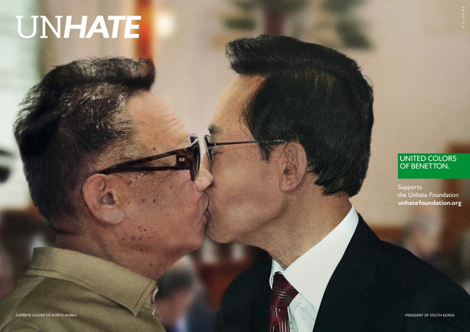


Benetton, "UNHATE" campaign
Ad Agency: Fabrica, Italy, 2011.
Benetton's recent "UNHATE" campaign, was able to manufacture a final kiss (kiss of death?) between Kim and South Korean president, Lee Myung-bak. This was an interesting campaign featuring several adversarial world leaders in intimate positions.


Amnesty International Portugal, "Tyrannybook" app
Ad Agency: Leo Burnett, Iberia, 2010.

Kim Jong-il profile, Tyrannybook.
Tyrannybook, a digital app designed and implemented by Leo Burnett Iberia in for Amnesty International Portugal in 2010, This was a social network (which has since been discontinued) dedicated to the surveillance of some of the most tyrannical world leaders that violate human rights.

Modelled on the look and aesthetics of Facebook, both users and the organization can update leaders' profiles on their most recent abuses. Users could also link up as allies and participate in group discussions, exchange points of view and discuss current events.

While this app has now expired, it may have been a foretelling of the role Facebook would play in the 2011 Arab Spring uprising through the Middle East.


With Kim Jong-il kicking the bucket, advertisers now have one less dictator to use in their messages. 2011 has been a terrible year for oppressive global leaders.

Sep 9, 2011

9/11 & Advertising Exploitation

Continuing on from my previous 9/11-themed blog post, here's a look at some of the more sinister examples of advertising which exploited the tragedy of the event and its global impact. It seems advertisers just can't seem to stay away from the iconic imagery of the twin towers of the World Trade Center (WTC) in lower Manhattan, New York City.


USA Discounters
Ad Agency: Levenson and Hill, Dallas.

Here is a recent example of 9/11 themed advertising for USA Discounters. USA Discounters is a not-so-popular credit store that "has been serving all military and government employees since May 1991." The towering body copy is the Declaration of Independence.

The tagline reads "The things we stand for still stand".

What a tacky ten year anniversary.


Khaleej Times, Dubai.

On the anniversary of 9/11 in 2007, the Khaleej Times,"the No. 1 English language daily paper published in Dubai, United Arab Emirates," employed a cheap visual trick in this full page anti-smoking ad. The headline message reads "5.4 million people die of smoking related causes every year. That's 2000 times a 9/11."


ASH (Action for Smoking Health)
Ad Agency: DDB NZ
Another cigarrette / tower visual theme was used by DDB NZ for ASH (Action for Smoking Health). This New Zealand based ad is almost a direct rip-off of the Khaleej Times ad which came out a year earlier in Dubai.

Why not go a step further and have a sky blue colored lighter - with an airplane graphic on its side, coming in sideways lighting up the cigarette towers. Little pieces of ash could be added - floating off the top to represent the WTC victims who jumped to their death.

If you don't quit smoking, will that be a victory to the terrorists?

We get it. Smoking kills. But it is really necessary to present the message this way?


"Titanic", Solidarités
Ad Agency: BBDP & FILS, Paris, France.
French humanitarian organization, Solidarités, exploits TWO tragedies for its global health hazard - "non-drinking water." The goofy diorama equation of a sinking Titanic plus the twin towers - complete with paper cut out passenger planes looming, multiplied by 2000 (couldn't they find another world-famous tragedy where 2000 people died?) equals a glass of dirty, lethal non-drinking water.

Ad agency, BBDP & FILS, also produced a TV / digital ad for the campaign - complete with an odd, floating, drifty music box type background music.


I'm no math genius, but something in that insensitive sum just doesn't add up!


Courrier International
Ad Agency: Saatchi & Saatchi, France.
Another 9/11 print ad from France - this one for Paris-based weekly, Courrier International. With the tagline   "Learn to anticipate", the geniuses at Saatchi & Saatchi France have miraculously solved the tragedy by concluding that the WTC architects could have saved lives by only building the twin towers to about 50 floors.

Sacré bleu! The hijacked planes completely miss their target, each other and the ad misses any semblance of common sense and dignity.


El Pais, Spain
Ad Agency: Ogilvy and Mather, Colombia.

It's all fun & games for Spain's largest national newspaper, El Pais. The double page ad offers a challenge to Spanish readers to spot the mistakes in this 9/11 image. For instance - did you know that the initial tower was hit much further up, the second plane to hit the WTC was not a Hercules military transport plane and the Transamerica Pyramid is in San Francisco not New York?

Yes. There is something wrong with this picture. But it's not just the photoshopping.


The Moscow News, Russia
Ad Agency: BBDO Moscow
Another 9/11 exploitation ad for another national newspaper, this one is Russian weekly, The Moscow News. This is the most artistically crafted 9/11 depiction of the bunch. A digital papercraft recreation of the exploding WTC towers.

Not artistically offensive enough for you? There's also a Hiroshima version of this ad.


"Tsunami", World Wildlife Fund
DDB Brasil, Brazil
And finally, what I consider to be the pièce de résistance of 9/11 exploitation advertising over the last decade. DDB Brazil decided to mock up this print ad (allegedly without the consent of their client - the World Wildlife Fund).

A broadcast version of the "Tsunami" ad was also produced.


The message in these ads, once again reduces the 9/11 tragedy to the number of deaths. After recreating the event digitally and then adding extra passenger jets, the ad claims:

"In 2005, the tsunami killed 280,000 people.
That's 100 times more deaths.
Our planet is brutally powerful.
Respect it.
Conserve it."

After presenting the campaign idea to the client, the World Wildlife Fund or WWF, (where it was summarily rejected), the agency secretly ran the print version of the ad in a small Sao Paulo newspaper. This was so the campaign could then be entered into advertising awards shows such as the One Show event in 2009.

Read the story of the full schemozzle of a SNAFU here.

Ultimately, the group of creatives at DDB Brasil were so enamoured with their campaign, they lost sight of the fact they were comparing a man-made global terrorist act with an act of nature. Both were catastrophic yet incomparable. Going behind the back of the WWF so it could be award show eligible scaled the depths of poor taste to serve narrow-minded egos.


It is quite clear from all of these ads (notice how the majority are from agencies outside North America) that the use of 9/11 imagery without any sensibility or empathy has only shown to exploit the event. People might equate it to anti-American sentiment abroad, but ultimately it's poor judgement and decision making by the creative directors who signed it off.