May 31, 2011

Does Wonderbra lift and separate from the other handful of bra brands?

Over the last few years, there's been a particular branding campaign which has captured my gaze.

Even though the campaign isn't directed at me, I still notice these ads and can't look away.

"DD", Saatchi & Saatchi, 2006, 

Wonderbra is a lingerie company that's been around for most of the last century but really only uplifted its name globally in the 1990's. They differentiated themselves as the bra brand which not only enhances a woman's bust line but makes heads turn.

"Hello Boys", TBWA, 1994.


A controversial print / poster / billboard outdoor ad campaign by TBWA in 1994, with Eva Herzigova, kicked off this new creative strategy which spanned the globe and covered numerous different ad agencies.

But over the last decade, the branding campaign switched focus to a strategy where the ads displayed don't show the cleavage being enhanced but the results and consequences.

Focussing on the outcome rather than the eye-grabbing spectacle of the bras themselves, the campaign lets the viewer make the connection.

Some of these are rather obvious while others are more subtle and make you think.


"Shoes", Saatchi & Saatchi Singapore, 2002.
This ad caught my eye in a creative advertising magazine. It may not be apparent at first, but I think it works on two levels. The woman in the ad can't see her feet because she's wearing a Wonderbra. So she's unaware of the mismatched shoes. I also thought that no one else on the street notices her shoes as they are all looking at the woman's cleavage (not shown).


"Umbrella", Publicis, Paris, France, 2007.
It takes a while for some people to get this one.

It's not the vacant outdoor courtyard. Or the number of shopping bags.

(What's holding the umbrella?)


"Friends", Publicis, France, 2009.
A more obvious one but still direct and simple.


"Baby", possible spec work / mock ad.
This one is both funny and creepy at the same time. I can't seem to find an agency source for this ad which makes me think it may be a spec or mock / parody.


"Scooter", TBWA Praha, Czech Republic.
Not so subtle but still lets the viewer make the leap by the way the image has been cropped below the chest line.


"Economist", DDB Worldwide, Singapore.
This ad parodies the well-known,  long-running outdoor campaign for The Economist which is "written by intellectuals for intellectuals."

Some people have criticized this ad regarding its intention. Is the Wonderbra wearer quoted ("Linda Foster, CEO, aged 29") too smart for The Economist? Or is she not smart enough? Is it because she shows cleavage that she doesn't have to be smart to get where she wants? Is every man at her beck-and-call?

Or is it more simply that the bra works so well that the wearer can't see below it to read a magazine like "The Economist"?

I think the final suggestion is the idea DDB were trying to get across with this ad but some read it differently.


"Oranges", Copy: "Fits Naturally",  possible spec work / mock ad.
I couldn't find an agency reference for this ad so it may be another spec or mock ad. The oranges being a metaphor for the perfect "natural fit".


"Pants", possible spec work / mock ad.
Another possible spec / parody. The sheer number of these add to the brand as they are spread virally, but may be beyond the control of the Wonderbra company.


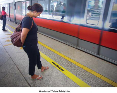
"Yellow Safety Line", Guerrilla Advertising, Euro RSCG, Singapore, 2008.
Interesting guerrilla placement by Euro RSCG Singapore - adding a second yellow safety line futher behind the regular line at public train stations in Singapore.


There has been criticism by some advertisers of Wonderbra's campaign in that it may not speak directly to its target audience of women. Some say that these ads have been designed by advertisers (predominantly men) for other advertisers (other men).

I don't agree with that entirely and I guess it differs from ad to ad. They do have a consistent visual element without the use of copy to convey their idea. It unhooks the viewer's mind to make the connection - that last step of "the big idea".

I've been meaning to cover this campaign in my blog for a while, so I'm glad to be finally getting this post off my chest (sorry for the pun/s... lol).

May 28, 2011

World's Longest Banner Ad
for BMW X3


I didn't believe it at first.

It innocently appeared as just another banner ad for the web.

This one for the
"All-New BMW X3."

An unassuming box size of just 300-by-250 pixels - the standard medium rectangle.

But when I moved my mouse over it, it expanded below the edge of my screen.

I began reading it, thinking it was just another half-page ad.

Something was different about this one.

It kept going.


The body copy wasn't the usual short and sharp prose that's needed to fit into a tight banner ad.

And on scrolling down to what I thought would be the end of the ad - what is usually about 600 pixels, it continued southwards.

So I scrolled further to see another full length screen of text-in-column.

Scanning the words, I could see they were toying with me.

Having the freedom to taunt me with words like "watermelon" and speak in a voice that was totally aware of what it was doing and what was going on.

The odd sub-header broke up the monotony of words.

But it just kept going.

Questions raced through my mind trying to fathom this massive block of text.

How much further would this banner ad continue?

Where is its limits?

Who would write such a thing?

How many men died during its construction?

How does this end?

And more importantly, WHERE does it end?

I felt like a mountain-climber scaling a giant cliff face in reverse.

Each sentence, each word and each letter was another crevice which my eyes had to latch on to, to advance further downwards.

Descending in to a mad, chaotic world with no boundaries.

Where no rules apply.

The ad even had the audacity to egg me on and encourage me to read further.

As if to say, "you've made it this far, well done... are you prepared to read further?"


My eyes "rappeled" over an entire backwards "R" in a single leap.

I didn't know what was happening at this point.

The BMW X3 was lost somewhere higher up.

Another sub-header.

And then a "speed-reader spork speed bump."

I had never seen one of those before.

But I didn't let it slow me down.

I was beginning to lose my grip.

The scroll bar's call beckoned my tiring mouse-wheel.

But I stuck through it with sheer persistence and continued to read.

By this point, I'll be honest... I just wanted to see the end.

Instant gratification at a depth of a bajillion pixels.

Words began losing meaning.

Sentences no longer made any sense.

But that didn't bother me.

I knew it was all part of the challenge.

A "reverse Mt Everest" of body copy.

I wondered who, if anyone, before me had scaled its zenith and survived to tell the story.

I fell past a "Pygmy village" in the flash of a keystroke.


By this point, my scrolling finger began to ache.

I could feel a blister forming.

Feelings of disorientation began to set in at this point.

My right arm may or may not have began to suffer the effects of carpal tunnel.

Perhaps descending to these murky depths had a pressure of several atmospheres - not of the barometric kind but of pure verbosity.

You could totally lose yourself staring down into the abyss.

Every paragraph disappeared into a horizon below me.

Each sentence felt like another mile.

But I stuck my mouse finger down and plowed on through it.


The temptation to scroll at this point became greater than ever.

Just scroll a little.

Like a free-fall.

Short.

Sharp.

Controlled.

Little bursts.

Skim-reading.

Get the gist and jump down a little further.

Don't drop too far at once though.

You might lose track and find yourself lost way down below.

My eyes began to water.

Blinking this far down was not an option.

The words I was reading at this point were losing meaning.

Just visual obstacles on a path to the end.

By this point, I think the hallucinations began.

Hidden gnomes crept out from behind the letters.

Leprechauns laughed at me from behind random text blocks.

I thought I could see rainbows at the bottom of my screen.

Maybe the much-fabled "Holy Grail Ending" would be waiting for me - at the finish.

A unicorn trotted out on to my screen.

I smiled at it.

It ran down the page but stopped at the bottom to turn and face me.

It winked at me, as if to beckon me to follow him down.

My mind wandered further and further away from what I was reading.

There was no blue or red pill to escape from this reality.

No magic cookies to make me bigger or smaller.

There was no rabbit either.

But this "rabbit hole" just kept going down...

And down...

And down.


Dropping in and out of consciousness.

Maybe this challenge was too great.

Too big a task to ask for this mere mortal.

Content at this point was secondary.

I dropped my guard.

My head dipped and my shoulder lurched forward.

My wrist went one way and my hand the other.

My scrolling finger slid across the mouse-wheel and I plummeted down.


I don't know how long I had blacked out for, but when I came to, I found myself at the end of this seemingly bottomless pit.

The scrolling odometer strapped across my right wrist read a depth of 18,000 pixels.

Insane!

It must have been a smooth landing because it didn't take long for my senses to return.

I read the last paragraph, but alas, this was not even the final stanza.

As it turns out, the REAL end of this ad is actually somewhere in the middle.

Somewhere back... UP... THERE.

How would I find it?

And when would this lunacy end?


I scrolled back up - reading the paragraphs I had missed but in a reverse order.

I guess one way of breaking the monotony of reading down, is to skim-read - what was missed - up in reverse.

Finally, I found it.

The much-fantasized end to this banner ad.

I was overcome with joy, excitement, relief and the urge for menthol-scented eye drops.

It read like an ending, and yet it was in the middle.

I guess the laws of "advertising physics" begin to distort and bend in such vast expanses.

Totally illogical.

And yet it made total sense.


I may not have learned all that much about the BMW X3.

But I can say that I read a fair majority of the world's longest banner ad and lived to tell the tale.

For what its worth, the ad was written by "evil" creatives at Toronto agency, Cundari.

If there is a wheel of kharma working its way through the "Adiverse", one day those very same creatives will be made to read an even greater banner ad.

Who knows?

Maybe it won't scroll downwards but in a left-to-right direction.

Or the even more torturous right-to-left.

And it will be written by me.

May 27, 2011

Sweet and Juicy Fruit Logos


I love fruit.


And I also love creative logo designs.

So it's only natural I do a blog post on the point where these two intertwine.

In general, fruits represent energy, health, freshness, honesty, summer, fun and goodness. Fruits tend to be very expressive. As a result, many designers take advantage of them to project a positive company or brand image.


APPLES


One of the most recognized apple logos is synonymous with the Apple name. The early "rainbow" apple was the company logo in the late 70's and through the 80's. The monochrome modern looking apple logo has remained the same since 2003.

Apples represent knowledge. This probably stems from biblical stories as well as other associations through history (e.g. Isaac Newton).

The above Woolworths logo is for a highly successful supermarket chain in Australia.


LEMONS & LIMES


Here are a few lemon & lime themed logos.


ORANGES represent energy.


PEARS


Another fruity shape which features prominently in logo design is the pear.


BANANAS, being a popular and common fruit, also have strong representation.


And of course, other exotic fruits are also used in logos.


I found the majority of these logos at Stock Logos - a site which collects, designs and sells logo designs for those like me who are somewhat design-challenged. I've added it to my list of advertising links on the right hand side.


WATERMELON - another popular fruit of designer's choice.


YOGHURT also has many fruity themes.


But I saved a few logos of my favorite fruit for last - the MANGO.