Sep 25, 2012

My Top 5 Swingin' Vintage
Jumpsuit Ads

It just wouldn't have been the Seventies without the easy slip-on slip-off all-in-one piece of clothing known as the jumpsuit. Synonymous with the era, it featured quite prominently in its time and was a sizzlin' hot fashion item.

Here are 5 of the best vintage print jumpsuit ads I could find in my on-going and endless search for classic ads. So grow out your chest hair, zip yourself up, stand proud and let's make these "comfortable fit" numbers happen!


5. Ah Men, "Jumpsuits For Ah Men", 1970's.
Here we have our hirsute model and his female companion sporting a hooded variation of the jumpsuit family in the popular terry toweling fabric. Great for absorbing any moisture or sweat build-up. The girl accessory shown is not included.

"Designed for people like you who make things happen." 


4. Pacesetter Knit Jumpsuits, 1972.
Clearly pitched towards the "Donny & Marie" crowd, this ad was featured in a vintage catalogue. A smokin' get-up for going out, featuring swinging flare bottoms, contrast color "side panel" striping down the sides and "slash pocket trims". Multicolor his 'n her shirts an optional extra.

"The newest, fast-moving, high fashion trends of today in men's wear."


3. The Fifth Season, "Terry Turn-Ons", 1978.
The stretch terry toweling has returned, with a high waistband and wide lapels brought to you by The Fifth Season. Our Wayne Newton wannabe has a disco date and he's not afraid to do her hustle.

"... a fit that makes the most of your body."


2. The Fifth Season, "The Before Or After Anything Suit", 1970's.
The Fifth Season return with the "Before Or After Anything" suit. Any commentary on this wouldn't do justice to the stellar body copy in the ad:

"The Before Or After Anything Suit.

Their heads are together. He cares for the good things of life. He's an achiever. He's confident. He likes his clothes smooth, sexy, comfortable - masculine.


The "Do Anything" jumpsuit goes to party, bistro, patio or pad.

She makes the right decisions about her man, about her looks, about her clothes.

The "Do Anything" jump suit of  SuperSuedePlus(TM) fits like a glove ... tough looking, but soft as a kitten. Designed by Jump Suits Ltd for people like you."


1. The Fifth Season, "One Easy Piece", 1970's.
This has to be one of my favorite vintage ads in my entire collection. The Fifth Season feature another jumpsuit number. And our Francis Ford Coppola look-alike has returned. He's ditched his lover from the previous ad, donned a polyester tight fit - known as "The Big Zip" and he looks hungry for some love action!

Who ever wrote these Fifth Season ads needs some kind of award for the blistering words - all zipped up into one suit of body copy. As I did for the previous ad, here's the full body text:

"One Easy Piece.

Because one is enough, when it's you. Show where you're headed in the ultimate fashion climax.

Fits so tight it shows all you've got... you're a walking turn-on. And treats your body as well as she does.

Easy on, easy off, quick as a flick of her tongue. Sexy cool crinkle cloth for those hot nights to come. Designed with your desires in mind... she'll eat you alive in it.

The Big Zip in 50% polyester / 50% cotton. Long-sleeved in rust, blue or black. Short-sleeved in natural, blue or camel.

Are you man enough to fill it?"


Apr 13, 2012

A Titanic Addiversary

With the 100 year anniversary of the world's most famous sinking tragedy fast approaching, I thought I'd dig up a few ads from eras bygone and recent related to the Titanic.


White Star Line, Titanic Poster, 1912
This is one of several original posters from 1912 leading up to the fateful date, promoting the first (and final) voyage of "the largest liner in the world".


R.M.S. Titanic, "Vinolia Otto Toilet Soap", 1912.
And the merchandising. Published only once, a black & white version of this ad (with a slightly different layout) appeared in the April 6, 1912 edition of the London Illustrated News. The Toilet Soap was provided to First Class passengers and also available for purchase by the London public.


Titanic Return Voyage, 1912.
White Star Line also advertised in New York for the return trip from Pier 59 back to Europe. Obviously it never eventuated.


It seems advertisers steered clear of referencing the Titanic in any way until the popularity of the award-winning blockbuster movie in 1997 revived its popularity (I haven't been able to find any Titanic-themed ads before 2000).

Here are several print ads I found that pick up on the Titanic theme in different ways.

TAM Airlines Onboard Entertainment, "Titanic"
Ad Agency: Y&R Brazil, 2008.
Capitalizing on the success of the Titanic blockbuster movie, Y&R Brazil offers a different perspective of the event for TAM Airlines Onboard Entertainment.


Orange, "Iceberg"
Ad Agency: Ignitionk, Madrid, Spain, April, 2009.
Ignitionk went for a text & space approach to help illustrate Orange's audiodescription system for the blind.


Washin Opticians, "Titanic"
Ad Agency: Grey Tokyo, 2011.
One of two Titanic themed ads that sells the benefits of optical eyewear, Grey Tokyo illustrate the outcome had the ocean liner's captain and crew been wearing glasses by Washin Opticians.


Optics Schilling, "Titanic"
Ad Agency: Unitas-RNL, Santiago, Chile, 2009.
In this second eyewear ad (which actually came first chronologically), Unitas-RNL shows the end result thanks to Optics Schilling glasses.


Another "theme" I noticed in recent Titanic-based ads was that several focussed on the ship's size.

Megastar Cineplex, "Titanic"
Ad Agency: Ogily & Mather, Vietnam 2007.


Vodafone Mobile Video Store, "Titanic"
Ad Agency: Scholz & Friends NRW, Dusseldorf, Germany, January, 2010.

Both of these ads "bend" the visual by presenting the Titanic as being small or miniature. In both examples, the iceberg is reduced to an ice cube. And both ads are selling the idea of watching the big blockbuster movie on a small screen (the first as a negative and the second as a positive).


Another reoccuring theme I found in recent advertising which references the Titanic refers to the famous "I'm Flying" romantic sequence from the movie.

Utopolis Group Of Cinemas, "Titanic"
Ad Agency: Duval Guillaume, Antwerp Belgium 2007.


Toys R Us, "Titanic"
Ad Agency: Volcano Advertising, Johannesburg SA, 2007.


Sanyo XactiCA8, "Titanic"
Ad Agency: Whybin TBWA Tequila, Sydney, Australia, 2008.


Suraj Electronics, "Pixels"
Ad Agency: JWT, New Dehli, India, 2010.
Credit should probably go to the first two of these as they came out in the same year. And at least the Australian one takes it underwater. In my opinion, the last one from India is the weakest of these.


I did find several other recent ads that reference the Titanic but the rationale or strategy tie-in with the product or benefit was either weak, sunk altogether or perhaps lost in translation.


Feb 17, 2012

PETA smacks a bitch up for veganism!

First, here's the TV ad that everyone's getting beat up about.


The commercial is another floor-buster in poor taste for militant ethical rights group, PETA (or People for the Ethical Treatment of Animals).

I didn't catch this on TV and I'm not sure what media buy PETA has for this, but it may go viral for all the wrong reasons. When I clicked on a link to PETA's YouTube channel and watched this PSA parody for the first time, the PETA name immediately raised my BS meter - and with good reason.

The voice over is narrated by former SNL comedian, Kevin Nealon, and reads:


"This is Jessica.
She suffers from B.W.V.A.K.T-BOOM...  


'Boyfriend Went Vegan And Knocked The Bottom Out Of Me.'


A painful condition that occurs when boyfriends go vegan and can suddenly bring it like a tantric porn star.
For Jessica, it's too late.


(Boyfriend) 'Oh you're back... you feeling better?'


Please go to bwvaktboom.com and learn to go vegan... safely."


In this ad, titled "Boyfriend Went Vegan", the scantily clad girlfriend in a jacket, Jessica, is all battered and bruised complete with a fake neck brace. The premise is that she is in this state from repeated roughhousing and non-stop sex as a result of suffering from a fictitious condition - "B.W.V.A.K.T.-BOOM" or Boyfriend Went Vegan And Knocked The Bottom Out Of Me.

But I really think it's PETA that have "knocked the bottom" out of taste and decency for their cause. In a lame attempt at controversy and humor, the boyfriend is the cause of all this mayhem. "Jessica" gives off a faint smile at the end, as if to say it's all worth it.

And viewers are then urged to visit the website URL to find out more information on going vegan. And here there's such pearls of wisdom to protect a woman from this syndrome, including tips such as: 

* Wearing a helmet (“strap it down, hop in bed and hold on tight”).
* Wearing goggles to “protect your corneas from his turbocharged loads”.
* Strengthening your pelvic floor muscles so you can handle his ‘superpower’.


At the end of my initial viewing, I have to say I was a little puzzled. I had never heard that going vegan turns you into a horny sex fiend (or violent misogynist) who can then manipulate your partners (or victims) into going out to grab some more fruit and veggies and then coming back for more.

And so the whole set-up becomes a stretch... a WALLOPING stretch - which isn't unusual for PETA, who continually manage to drop the bar of ethical standards for the sake of headlines. PETA have already come out to defend the ad stating that its "tongue-in-cheek", "humorous" (by whose standards?) and because the girl gives a "mischievous" smile at the end, she must like it. And so this must mean that its OK (especially if its in this fictitious far-fetched hypothetical scenario).

I believe I've heard rapists use a similar line of defence.


The ad agency responsible for this battered piece of waffle, Matter (who don't appear to have any online presence), most likely managed to convince PETA's marketing department that the controversy and headlines this will generate will outweigh the criticism. The convoluted sell will do little to persuade people to try veganism. Some will say that its generated a lot of word-of-mouth and "buzz". Sure. Maybe a few gullible people might take on the belief that not eating chicken and eggs gives your hormones a boost. Are there any scientific studies backing this up?


This is where the whole thing becomes offensive. PETA would rather have guys munching celery sticks and granola than steaks or cheese so that they can then slap girls around in the bedroom. To them, that is a forgivable trade-off.

This has nothing to do with veganism or vegetarianism but everything to do with PETA's shitty name as an "altruistic" organization which I feel has shamelessly peddled violence against women in a humorless vignette. The fact that PETA's President is a woman makes the irony all the more hard-hitting.


The impression many people get is that PETA will defend the rights of animals at the expense of the rights of women.

The impression I get (and have for quite some time now) is that PETA is a PITA.


Dec 20, 2011

Kim-vertising

Hot on the heels of other fallen dictators and terrorist leaders who have recently died, we have the passing of North Korea's "Dear Leader" seeing out the year (although there is still about a week and half left this year for Ahmadinejad, Mugabe or Castro if they want to join the list).

Following my previous blog posts on Bin Laden's Legacy in Advertising and Gaddafi in Advertising, it's only fair to look at "faminist" Kim Jong-il's image as used in advertising (primarily print and posters here).


International Society for Human Rights (ISHR)
Ad Agency: Scholz & Friends, Berlin, Germany, 2009.

Celebrating 60 years of the ISHR promoting human rights, the anniversary cakes were "shared" with various leaders of dictatorships around the world, including Kim.


ISHR
Ad Agency: Ogilvy, Frankfurt, Germany. 2010

The ISHR more recently also had a campaign showing world dictators scared of the modern mouse. This particular ad is poorly photoshopped but still conveys the intended message.


S-K Bedding & Mattresses
"Who says there's no rest for the wicked?"
Ad Agency: Publicis, South Africa, 2004.
SK Bedding and Publicis used North Korea Freedom Day, April 28, 2004, to help promote their product.


Nulaid Eggs
"History's produced a lot of bad eggs.
Thankfully, ours are always good."
Ad Agency: The Jupiter Drawing Room, South Africa, 2007.

Also from South Africa, Nulaid Eggs uses Jong-il's likeness in egg form to illustrate a bad egg.


Amnesty International
Ad Agency: Contrapunto BBDO, Madrid, Spain, 2008.


Amnesty International
"See no evil?"
Ad Agency: LINs, Malaysia, 2008.


Amnesty International
"Your signature has the power"
Ad Agency: TBWA, Paris, France, 2008.

2008 saw a volley of ad rockets fired by Amnesty International against North Korea's supreme leader as well as others.

Contrapunto BBDO used the fly on the nose (using Amnesty's logo) as a symbol and visual metaphor for human rights abuses which is as plain as the nose on their face, right in front of these leaders' eyes and yet never quite visible to them.

The campaign from LINs in Malaysia is not quite as clear. It uses the recent optical illusion meme of staring at a point (in this case a red crosshair mark) for several minutes and then looking at a white surface to reveal a face illusion. These directions aren't given in the ad and therefore assumed that people know what to do when viewing it. Also there is a tenuous link between this and the ad's message ("See no evil?") which may have been somewhat lost in translation (?).

The final ad here, by TBWA Paris, is the most clear and powerful (and also featured in my Gaddafi blog post).


Reporters Without Borders
"Only a free press can hurt them.
Support our fight."
Ad Agency: Saatchi & Saatchi, Paris, France, 2010

Reporters Without Borders and Saatchi & Saatchi Paris put together a campaign last year which reverts to the visual metaphor of a crushed press image of global dictators.


Benetton, "UNHATE" campaign
Ad Agency: Fabrica, Italy, 2011.
Benetton's recent "UNHATE" campaign, was able to manufacture a final kiss (kiss of death?) between Kim and South Korean president, Lee Myung-bak. This was an interesting campaign featuring several adversarial world leaders in intimate positions.


Amnesty International Portugal, "Tyrannybook" app
Ad Agency: Leo Burnett, Iberia, 2010.

Kim Jong-il profile, Tyrannybook.
Tyrannybook, a digital app designed and implemented by Leo Burnett Iberia in for Amnesty International Portugal in 2010, This was a social network (which has since been discontinued) dedicated to the surveillance of some of the most tyrannical world leaders that violate human rights.

Modelled on the look and aesthetics of Facebook, both users and the organization can update leaders' profiles on their most recent abuses. Users could also link up as allies and participate in group discussions, exchange points of view and discuss current events.

While this app has now expired, it may have been a foretelling of the role Facebook would play in the 2011 Arab Spring uprising through the Middle East.


With Kim Jong-il kicking the bucket, advertisers now have one less dictator to use in their messages. 2011 has been a terrible year for oppressive global leaders.

Oct 20, 2011

Gaddafi in Advertising

As a follow-up to my Bin Laden Advertising Legacy post a few months ago, here's a look at the just recently deceased Moammar Gaddafi and his appearances in advertising.

Amnesty International
"Your signature has the power"
Ad Agency: TBWA Paris, France.
Amnesty International France used several dictators in this campaign to illustrate the power of a signature.


International Society for Human Rights (ISHR)
Ad Agency: Ogilvy, Frankfurt, Germany
Following on from Amnesty's campaign, this campaign for the International Society for Human Rights shows modern dictators such as Gaddafi scared of a mouse (the clicking kind).


Gulf News
"Perspective. Irrespective."
Ad Agency: Derek & Priti, Dubai, UAE
Dictators have been all the rage this year in the Middle East. And what better place to read about it than in Gulf News.


France 24, "The Tweets"
Ad Agency: Marcel, Paris, France.

A parody of Alfred Hitchcock's "The Birds" film poster. French international news channel, France 24, compares the bringing down of Gaddafi's regime by viral social media to the menacing birds in Hitchcock's movie that send a town into chaos.


This was accompanied.by a 3D animation / viral video to help promote the station's new twitter feed and it's role in the Arab Spring.


Lifebroker
Ad Agency: McCann Erickson, Melbourne, Australia
Tongue-in-cheek ad by Australian life insurance firm, Lifebroker. If only Moammar had taken out a policy...


With Gaddafi now eliminated, advertisers may need to consider using the depiction of other dictators - such as Iran's Amadinehjad Syria's Al-Assad or Venezeula's Chavez (who's fast losing all his global pals).

Sep 9, 2011

9/11 & Advertising Exploitation

Continuing on from my previous 9/11-themed blog post, here's a look at some of the more sinister examples of advertising which exploited the tragedy of the event and its global impact. It seems advertisers just can't seem to stay away from the iconic imagery of the twin towers of the World Trade Center (WTC) in lower Manhattan, New York City.


USA Discounters
Ad Agency: Levenson and Hill, Dallas.

Here is a recent example of 9/11 themed advertising for USA Discounters. USA Discounters is a not-so-popular credit store that "has been serving all military and government employees since May 1991." The towering body copy is the Declaration of Independence.

The tagline reads "The things we stand for still stand".

What a tacky ten year anniversary.


Khaleej Times, Dubai.

On the anniversary of 9/11 in 2007, the Khaleej Times,"the No. 1 English language daily paper published in Dubai, United Arab Emirates," employed a cheap visual trick in this full page anti-smoking ad. The headline message reads "5.4 million people die of smoking related causes every year. That's 2000 times a 9/11."


ASH (Action for Smoking Health)
Ad Agency: DDB NZ
Another cigarrette / tower visual theme was used by DDB NZ for ASH (Action for Smoking Health). This New Zealand based ad is almost a direct rip-off of the Khaleej Times ad which came out a year earlier in Dubai.

Why not go a step further and have a sky blue colored lighter - with an airplane graphic on its side, coming in sideways lighting up the cigarette towers. Little pieces of ash could be added - floating off the top to represent the WTC victims who jumped to their death.

If you don't quit smoking, will that be a victory to the terrorists?

We get it. Smoking kills. But it is really necessary to present the message this way?


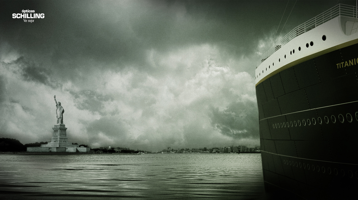
"Titanic", Solidarités
Ad Agency: BBDP & FILS, Paris, France.
French humanitarian organization, Solidarités, exploits TWO tragedies for its global health hazard - "non-drinking water." The goofy diorama equation of a sinking Titanic plus the twin towers - complete with paper cut out passenger planes looming, multiplied by 2000 (couldn't they find another world-famous tragedy where 2000 people died?) equals a glass of dirty, lethal non-drinking water.

Ad agency, BBDP & FILS, also produced a TV / digital ad for the campaign - complete with an odd, floating, drifty music box type background music.


I'm no math genius, but something in that insensitive sum just doesn't add up!


Courrier International
Ad Agency: Saatchi & Saatchi, France.
Another 9/11 print ad from France - this one for Paris-based weekly, Courrier International. With the tagline   "Learn to anticipate", the geniuses at Saatchi & Saatchi France have miraculously solved the tragedy by concluding that the WTC architects could have saved lives by only building the twin towers to about 50 floors.

Sacré bleu! The hijacked planes completely miss their target, each other and the ad misses any semblance of common sense and dignity.


El Pais, Spain
Ad Agency: Ogilvy and Mather, Colombia.

It's all fun & games for Spain's largest national newspaper, El Pais. The double page ad offers a challenge to Spanish readers to spot the mistakes in this 9/11 image. For instance - did you know that the initial tower was hit much further up, the second plane to hit the WTC was not a Hercules military transport plane and the Transamerica Pyramid is in San Francisco not New York?

Yes. There is something wrong with this picture. But it's not just the photoshopping.


The Moscow News, Russia
Ad Agency: BBDO Moscow
Another 9/11 exploitation ad for another national newspaper, this one is Russian weekly, The Moscow News. This is the most artistically crafted 9/11 depiction of the bunch. A digital papercraft recreation of the exploding WTC towers.

Not artistically offensive enough for you? There's also a Hiroshima version of this ad.


"Tsunami", World Wildlife Fund
DDB Brasil, Brazil
And finally, what I consider to be the pièce de résistance of 9/11 exploitation advertising over the last decade. DDB Brazil decided to mock up this print ad (allegedly without the consent of their client - the World Wildlife Fund).

A broadcast version of the "Tsunami" ad was also produced.


The message in these ads, once again reduces the 9/11 tragedy to the number of deaths. After recreating the event digitally and then adding extra passenger jets, the ad claims:

"In 2005, the tsunami killed 280,000 people.
That's 100 times more deaths.
Our planet is brutally powerful.
Respect it.
Conserve it."

After presenting the campaign idea to the client, the World Wildlife Fund or WWF, (where it was summarily rejected), the agency secretly ran the print version of the ad in a small Sao Paulo newspaper. This was so the campaign could then be entered into advertising awards shows such as the One Show event in 2009.

Read the story of the full schemozzle of a SNAFU here.

Ultimately, the group of creatives at DDB Brasil were so enamoured with their campaign, they lost sight of the fact they were comparing a man-made global terrorist act with an act of nature. Both were catastrophic yet incomparable. Going behind the back of the WWF so it could be award show eligible scaled the depths of poor taste to serve narrow-minded egos.


It is quite clear from all of these ads (notice how the majority are from agencies outside North America) that the use of 9/11 imagery without any sensibility or empathy has only shown to exploit the event. People might equate it to anti-American sentiment abroad, but ultimately it's poor judgement and decision making by the creative directors who signed it off.

Sep 6, 2011

Eerie Pre-9/11 Advertising

With the 10 year anniversary of the 9/11 terrorist attacks in NYC and Washington D.C. fast approaching, here's an overview of eerie, strange and just plain weird advertising that pre-dates 9/11 and creepily resembles visions of the tragic event.

I came across several of these print ads published years before the attacks.

Print Ad for Pakistan International Airlines, 1979.
Of the ads pre-dating 9/11, I found this one to be the oldest - and the creepiest.


Print Ad for Asbestos Corporation Ltd, 1981.
(Click image to read body copy)
Oddly enough, this ad - for asbestos of all things, is not only strange given the events of 9/11 which would occur 20 years later, but also the medical hazard that asbestos was later identified as. Note the tagline.


World Trade Center Brochure Ad, 1984.
Original Source
An auspicious headline for a World Trade Center brochure ad.


Print Ad for The Steel Institute of New York, early '90's.
An unfortunate ad (with a very amateurish layout) and a body copy line that reads:

"Structures built with steel can dramatically withstand the 
unusual dynamic forces generated by a catastrophic event 
-- whether from an earthquake, a hurricane, or even an explosion."


Print Ad for Cordant Technologies, 2001 (before 9/11)
Appearing in Business Week just months before 9/11, this ad for Cordant Technologies' jet engine division for new airfoil technology has a disturbing vision of foretelling.


Later this week, I'll look at advertising over the last decade which exploited the 9/11 tragedy.